Sunday 21 August 2011

ASSIGNMENT 1 .final ar box. images


ASSIGNMENT 1 .final posters


draft ar box


EVIDENCE :


draft poster. draft text


ASSIGNMENT 1. final markers. concept


The concept of a dice is simply easier for people to understand. Therefore, I chose to create markers similar to a dice, in order, the 'thunder-like' design is one. This will show a plain flat environment. Then, The 'two arrows' represent 2, which will show the top view of the environment and building. The third marker has 3 shapes, fourth marker with four rectangles, the star represents number 5, and the last marker, which is six, shows the whole model with the environment.


My posters are fairly simple, I chose to focus on the background, which is the environment, thus, both posters show the environment, the major colour is black, and the first poster is in alignment with the second if you put both posters next to each other. The first poster shows augmented reality which is what this assignment is all about. The second poster shows the process of getting to the step where everything comes together.

Saturday 13 August 2011

draft


One of the images that will show up using the markers will be the overall environment which will be the land the habitat is placed, showing how the habitat is surrounded by trees and the place will look quite deserted in the wilderness as the creature is extremely dangerous and therefore has to be placed in a place that not many people will go.


Friday 12 August 2011

visual graphic breakdown


I think the architecture piece of I.M. Pei is very bold and the ideas are very sharp.  The poster shows the architecture when it is at night time, where light can be seen through the glass pieces and where the reflection of light is the strongest at this period of the day. I think the image capture manage to show the form and structure of the building very well. The poster clearly focuses on the building itself, which is directing us straight to the main architecture.

And as for the painting, soft colour selections were used to illustrate Louvre Pyramid, the painting looked peaceful and in harmony with the surroundings. The light reflection is not as strong compared to the poster, this painting shows a different phase of the architecture where the building adds harmony and goes along with the environment surrounding it. This image shows the overall detail, which is a bigger image, consisting the surroundings along with the main architecture.

An architecture should always conform to the surrounding environment and other elements that are located at the same area, and I. M. Pei’s Louvre Pyramid shows how this unique, different, bold architecture can fit into an environment which can be seen quite the opposite of what the structure and design of Louvre Pyramid is.


graphic art

graphic art of Louvre Pyramid by I.M.Pei

painting:

image credit: Marina Paskina
reference: Marina Paskina's Art Gallery
http://www.mpaskina.com/en/

poster:


grids


project reflection


Reflection

The first assignment is about presenting a design with Augmented Reality, which looked really difficult and complex at the beginning, however, the process of learning how to function new software throughout the tutorials made things easier, showing how things are actually coming together bit by bit.

            The architect of my choice is I. M. Pei, a Chinese American who is well known for its modern architecture. And there’s one that really captured my attention, the Louvre Pyramid in Paris, the design is so bold and outstanding and it reminded me of the pyramid but this is built with glass and metal which is absolutely charming.

            In the first and second week, its related to creating creatures using Spore, it was fun creating monsters, and later, coming out with words, and getting idea and inspiration from the architect, his architecture and using them to develop the creatures.

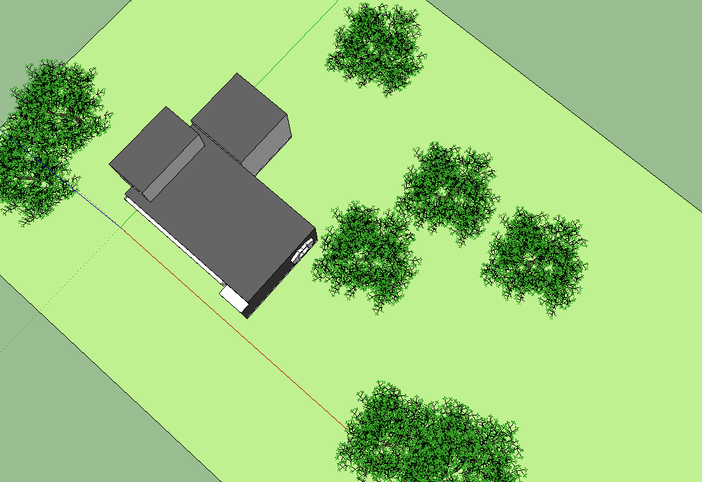
            Then came the part where we have to create environments and dwellings for the creatures, the ideas generated from sketching and drawing the plans out, also referring back to the themes and words. After having a rough sketch on paper, I did the environment and habitat with Sketchup, applying different textures that show relationship with the words.

The moment I saw the architecture building- Louvre Pyramid, the word bold came to mind, and that is how I relate all my designs to, from the environment, to the markers. I want to make my designs different, as in the markers doesn’t look similar to each other. For now, I think as its approaching closer towards the submission date, it is important to go back to the previous tasks and work with the designs again to fit the markers and the idea of creating the model, showing what the model will look like on the screen through the design of the markers as well as the posters which will serve as a background.


                       (316 words)

Friday 5 August 2011

Chosen environment- Environment 2. -developing environments


 section

 section

 side view

 front view


 top view

 side view


I've decided to use the second environment, but selecting the first model and develop it instead of using the second model. Therefore I came out with a simple boxy design, with edges, the idea generated from I.M. Pei's style in buildings. And so, I created this habitat.